Project
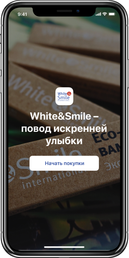
White & Smile mono brand online store offers products for at-home whitening and oral care from a world-famous French company.
In this app from the official Russian distributor of White & Smile, you can place orders, get discounts, participate in promotions and discover relevant content.
Goal
The client researched their target audience and demand for White & Smile products in Russia and decided to advertise on mobile platforms rather than via desktop.
Our goal was to develop a simple and convenient mobile app for iOS & Android which could quickly turn into the main sales channel.
Solution
We started with analytics, studied top Internet retail apps, chose the best solutions and adapted them for this project.
The client did not plan to change their online inventory and the loyalty program. However, we provided a feature to add new products and group them into categories, as well as quickly update the terms of the loyalty program for existing and new shoppers.
The loyalty scheme is calculated the same way for both the backend and the user. It was quite difficult to implement this, but this is done to double check the correct order amount and applied discounts. There will be no errors in the calculations.
Also, we created clean and clear user interface design: a shopper sees what discount they get and what it is for.
Rustam Mukhamedyanov, CEO of WINFOXThe potential online shoppers are not only e-consumers, but older adults as well. We thought out all our user scenarios combined with an intuitive user interface so that anyone can use this app, even your grandmother.
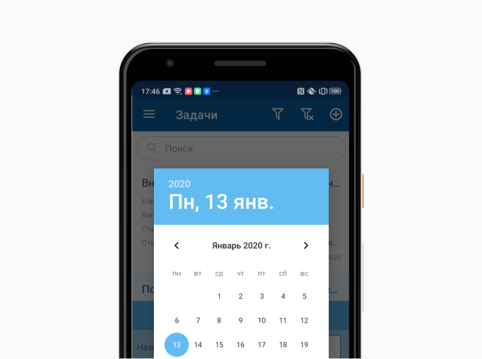
iOS & Android apps have a different UX and UI. It would have been easier, faster, and cheaper to use the same solution for both platforms. However, our goal was to develop a familiar and easy-to-use app on iOS & Android, so we applied Human Interface Guidelines and Google’s material design when creating our designs.
Alexander Klochko, UX/UI Designer at WINFOXTo speed up the design-to-development process, we used UI kits for iOS & Android.
Screen Designs
Catalog
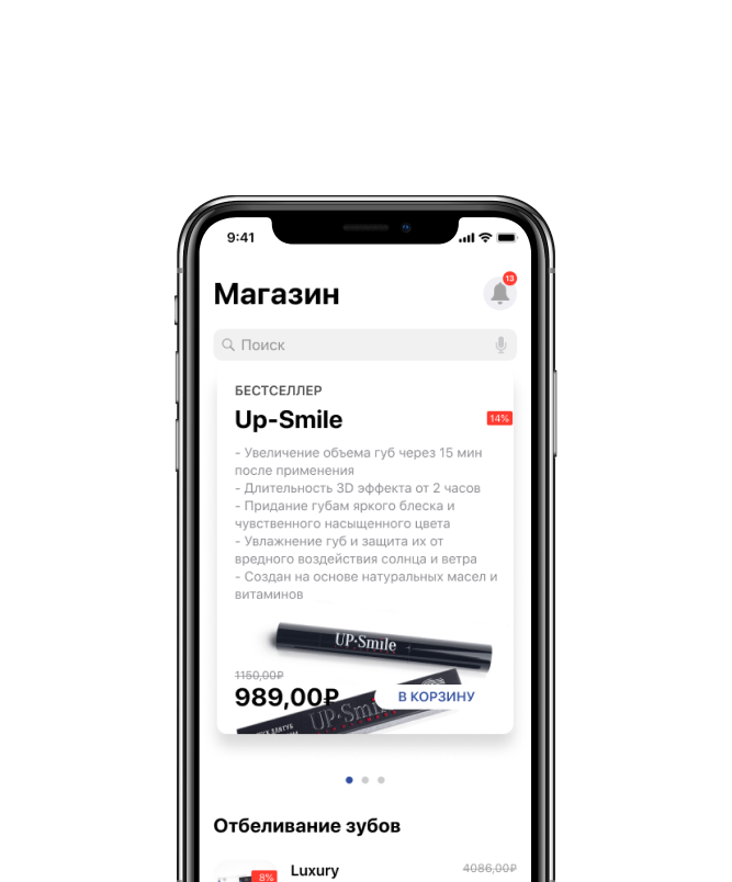
Products are displayed in the following categories: whitening, oral hygiene, and lip care. All categories are shown on one screen. Scroll the page to navigate between sections. No need to do it manually.
Alexander Klochko, UX / UI-designer at WINFOXThis online store does not have that many items. A scrollable catalog is the best solution.
Product Card
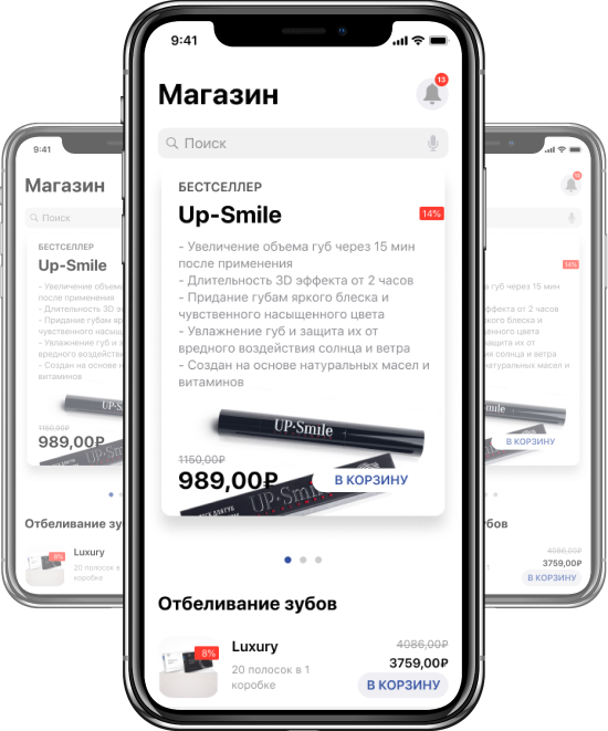
A banner with a large product image motivates users to be as good-looking, healthy and successful as those who already use the brand’s products. The product card contains all the information necessary for the purchase:
composition, methods of application, and a slider with product photo.

Cart
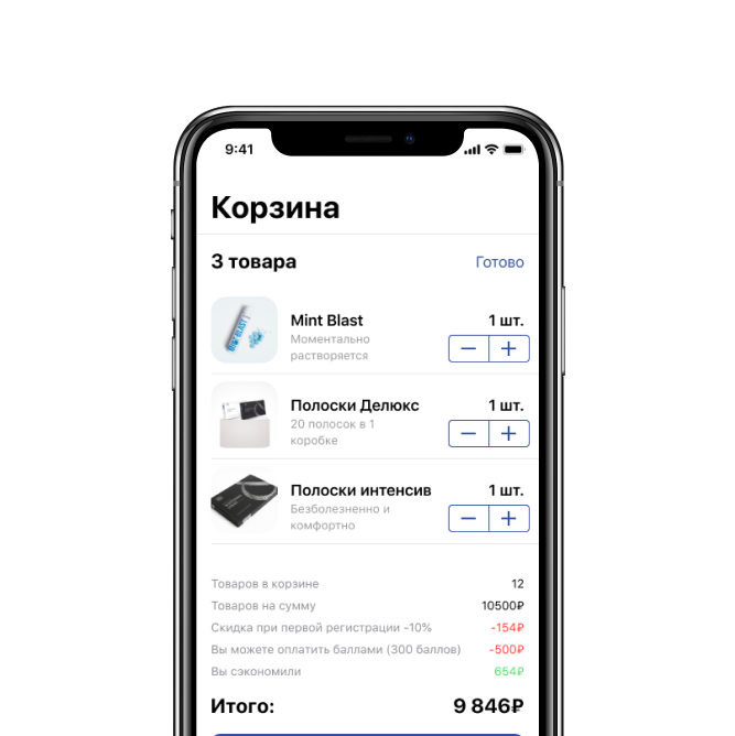
Before purchasing, user verifies the quantity of items in the order, the total amount, applied discount or promotion.
By swiping left, you can quickly remove items from the cart.

User Profile
Your personal account shows order history, earned discounts, favorite products, and enables you to change personal info and contact support.

Features
Quick Sign-Up
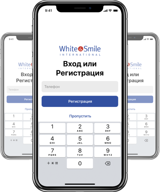
To sign up, just enter your phone number and verification code─no need to remember complex login and password.
Valery Sorokin, Project Manager at WINFOXWe did not aim at getting the user's email at all costs at their first sign-up. Instead, we chose the simplest and most convenient way of authorization─via phone number.
Purchase Reminders
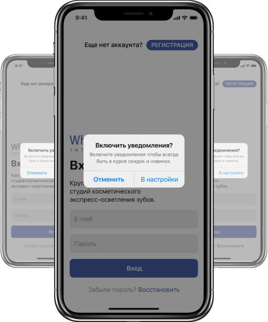
Whitening strips are effective only when used regularly. If after a certain period of time a customer does not re-purchase the strips, they receive a push notification with a reminder.
Delivery Method
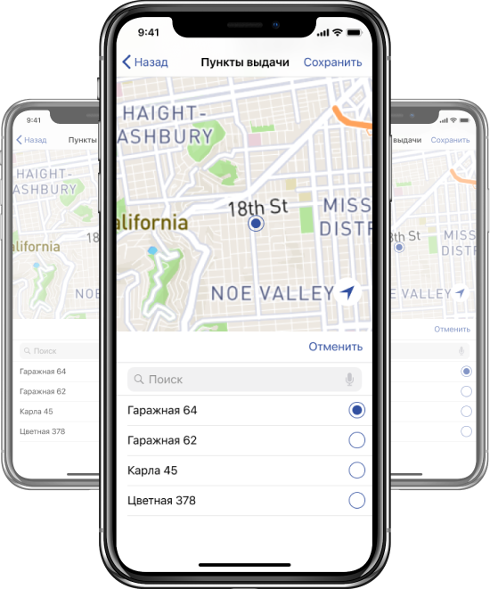
Customer can pick up their order at a Russian Post branch or at a SDEC delivery point. Delivery points are displayed on the map so that the shopper can easily finds the branch closest to their home or office.
Corporate Blog
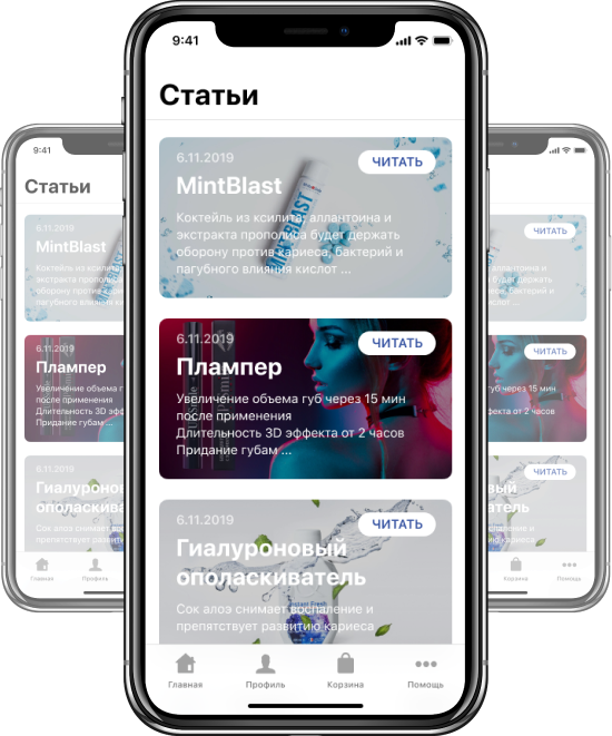
The app features a section with articles that help buyers choose and use White & Smile products correctly.
To make it easier for them to navigate the blog, article banners show the release date of the material, its title and summary.
Loyalty Program
Any shopper who makes a purchase within a day after signing up, receives a small gift.
Rustam Mukhamedyanov, WINFOX CEOWe designed an easy-to-use loyalty program─10% off after the first login, points accumulated for sign-up and every purchase, and free delivery for orders over 6 900 RUR. Everything to attract as many customers as possible!

Favorites
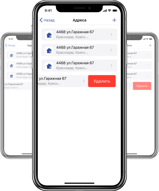
Save your favorite items and delivery addresses in "Favorites". Simply pick the desired delivery location when checking out instead of manually re-entering it.
Results
White & Smile products are now available in Russia─ just install a mobile app! Using contextual advertising, our client plans to promote White & Smile among their target audience and boost app downloads on Google's Play store & Apple's App store.
С помощью контекстной рекламы заказчик планирует продвигать приложение среди целевой аудитории и увеличивать количество скачиваний в сторах.
Project
team
Project Manager
Valery Sorokin
Technical Director
Alexander Khrushchev
UX/UI Designer
Alexander Klochko

